Optimise Hosted Checkout Page
The content on this page is for information only. It does not take into account the specific requirements of your business and we recommend you seek your own independent advice.
Features
We have added a lot of features to our Hosted Checkout Page. They will help you create a great payment experience for your customers:
- Help your customers pay faster by saving their payment details.
- Automatic number formatting and card BIN detection.
- Mobile responsive design with intuitive context-appropriate keyboard.
- WCAG level A compliant - anyone including visual impaired and older users can complete payments.
- Localised languages and currencies.
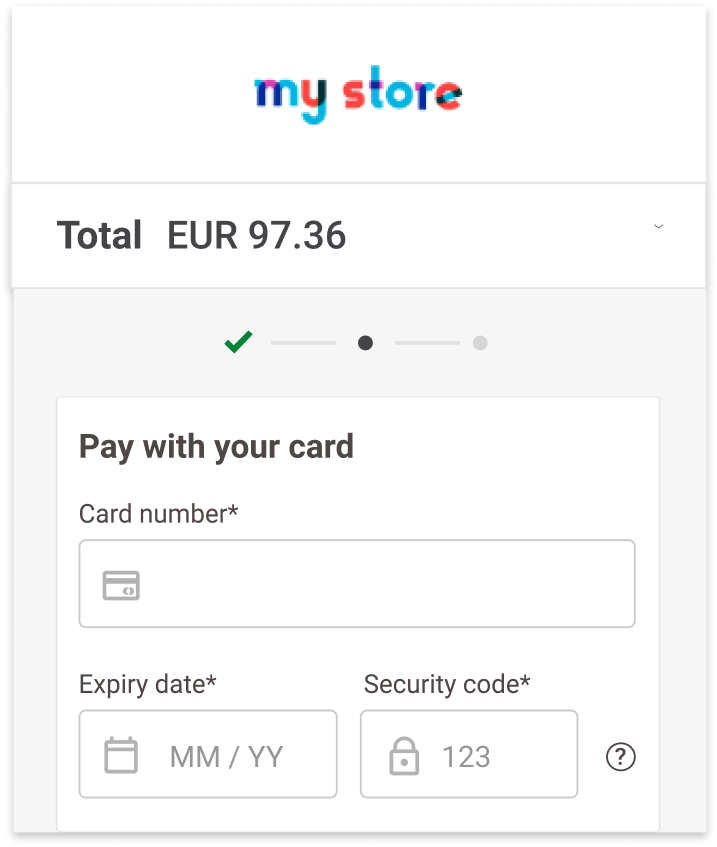
- Progress bar to increase confidence in completing transactions.
Best Practices
On top of the aforementioned features, find here the most important Do's and Don'ts when designing your customers' payment journey.
Do:
- Show as much information as possible in the order summary in both desktop and mobile. The order summary is the most important feature of the payment page. This includes tax, shipping cost, discounts, etc. in both desktop and mobile.
- Show logos of all available payment methods.
- Incorporate a lock icon on the page to increase the feeling of security. This can be anywhere, but is better if it is close to the Pay button.
- Include a progress bar on the page to reassure where customers are in the checkout journey.

- Customise the payment page look & feel to match your web shop, so it is a more seamless experience. Include your own logo or business name so customers know who they are purchasing from.
Do not:
- Do not hide your order summary. Some merchants disabled this and end users did not like this as it made them second guess what was in their shopping cart. This may cause them to abandon the checkout.

This is an example of the payment screen. The available currencies depend on your configuration, region and transaction context.
- Do not make your payment page look completely different from your web shop as it is disruptive. For example, if your web shop has a black background, make sure the payment page uses the same background colour.
- Do not use too many colours on your page as it may distract your customers from completing the transaction.
Recommendations
We strongly recommend that you also test your payment page design and complete checkout experience with real customers. No two payment page experiences are the same as it depends on your website's design, the products you sell, your key customer's purchasing behaviours, etc.
The feedback you get directly from your customers will help you further optimize your payment page while you create the optimal experience that is unique for your customers.